European Telecoms have returned in the news recently
following a couple of very interesting deals, especially looking at the
companies/people involved. More than the Nokia deal I am referring to Carlos
Slim deal in the Netherlands: http://www.telegraph.co.uk/finance/newsbysector/mediatechnologyandtelecoms/telecoms/10232706/Carlos-Slim-moves-into-Europe-with-6bn-KPN-offer.html
When the richest man in the world and telecom mogul decides
to invest in the most hated/underinvested sector in developed markets,
something is going on.
Fundamentals
I do not want to spend time on the fundamental side which
many of you would know much better than me. What personally caught my eye (on
top of Carlos Slim) are:
-
Complete fragmentation of the market , with 40 +
players vs 4 in the USA for a similarly sized market
-
Total absence from investors’ portfolios. Now it
has become almost accepted to invest in some selected European banks but no PM
would dare turning into a meeting with an overweight in telcos. Most people
have actually a zero weight
-
Regulator pushing for lower and lower prices
which are “unsustainable”, at least at the present level
But at the same time I also heard:
-
The regulator may move from a national
regulation to pan European regulation, thus looking at concentration levels on
a much bigger market
-
An interview with the CEO of Wind who was openly
talking about a new wave of M&A
Technicals
Conclusion first:
-
On a long term relative basis telecoms have gone
back to the level they were trading in the late 80’s, before the bubble started
-
On a shorter time frame (and relative to broad
market) they have now breached the downtrend and are turning up
-
On a stand alone basis they are back to where
they were in 1994 and are giving tentative signs of bottoming
-
Some selected stocks within the sector have
completed important long term patterns and are giving signs of life
It is very important to understand the charts I’ve been
using to come to this conclusion cover very long periods of time so the
potential turnaround would not happen in a matter of days or weeks but rather
over months and years.
I suggest to monitor the area closely for potential
investments. A sector undergoing a secular consolidation wave has a tailwind
that most other areas do not have. This means that these stocks may raise even
in a bearish environment, exactly like “old economy” stocks did in the
00-03 period.
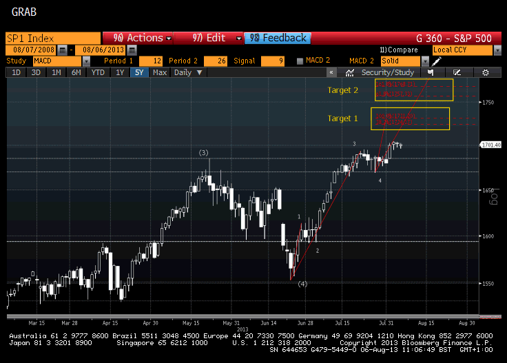
Analysis
The chart below (chart1) shows the long term relative
performance of telcos vs the broad market (SXXE, euro Stoxx). The bubble period
and the subsequent collapse is evident. We also can notice a divergence between
price and MACD which signals a potential turnaround
Chart1
Zooming in (chart2) on the weekly relative chart, we
can see:
-
A completed abc pattern
-
A projection level has been hit
-
Macd has broken its resistance line, a move than
normally gives very good warning signal of an impending break of price (higher)
Chart2
Moving to pure price charts, chart3 shows how we have gone
all the way back to 1994/96, before the bubble rally in the second half od the
90’s.
More precisely, price has so far found support just above
200 and a clear monthly divergence has formed, both bullish signals.
Chart3
The weekly chart (chart4) shows other bullish signs:
-
Another bullish macd break
-
A falling wedge (reversal pattern) that has been
broken on the upside
Prices could well fall a bit more and retest the lower
boundary of the wedge but the long term picture in my opinion is univocally
bullish.
It is very important to understand the charts I’ve been
using to come to this conclusion cover very long periods of time so the
potential turnaround would not happen in a matter of days or weeks but rather
over months and years.
Chart4
To finish, an example of a telecom stock that has dropped
97% from the top over almost 20 years and that now shows a completed abc
correction: Telecom italia
I am not suggesting to buy it, I only want to show that if
even an over levered, badly managed and politically interfered company like
this can rebound, anything can happen.
Chart5