Thursday 29 August 2013

US Dollar Index


Intro

The US Dollar has been moving in a sideway fashion for the best part of 6 years. More recently the trading range has become even narrower and the Dollar index has been fluctuating in a 7% band for the last 18 months.

USD has the characteristic of alternating long consolidations and equally long trending periods. I believe we are on the verge of a new strong uptrend in the currency.

 Conclusion
A monthly close above 85 would trigger a very strong buy signal. First target 90 and if this is broken then we have a confirmed trend that can go up to 105 and 120  in the coming years. The economic/financial implications will be very important.

 
Analysis
The long term chart (chart1) shows an alternation of consolidations and trending periods. The MACD indicator is flirting with the upper boundary of a triangle. A break above the line tends to give excellent warning signal of an incoming break of price above its resistance


Chart1


Zooming in, we can appreciate how the index has found support for the 3rd time, confirming the validity of the red trendline. This month price action has created an hammer, a reversal pattern.

The rectangle which has offered support and resistance levels has a measured target of just above 90, at the same level where we have the larger consolidation boundaries and the downsloping trendline that has contained the USD moves since early 80’s.

A close above 85 would point for a minimum retest of the 90 level and if that doesn’t stop it then we can move to 105 (larger rectangle measured move)


Chart2


Moving on the weekly chart we can appreciate how recent price action has created a diamond (chart3, gold rectangle). Deciding when/if diamond patterns have been broken is a tricky thing because of the diagonal boundaries but a break of the macd on the upside should give us a good warning sign that the move has finally started.


Chart3


Wednesday 28 August 2013

US 10Y


Yields have peaked at 2.93, just shy of the 3% target I’ve mentioned before. My central scenario is one of yields moving sideways between 2.4% and 3% in the coming months.

A break of the 3% level would point to a continuation to 4%.


Analysis


1)      Yields are tracing a potential evening star (see red rectangle), with the central candle being a shooting star.

2)      On top of this we are very close to the upper boundary of the channel that has contained the move since 2009

3)      We are bps from the 100%projection of the head and shoulder bottom

Friday 16 August 2013

S&P500


Quick update on the S&P500:

I showed that:

-          Equities are the only asset class left (with cash) to see positive performance on both a relative and absolute basis. So the investment universe as a whole is narrower

-          Every major equity market (Nikkei, FTSE, EU50, S&P) is showing signs of internal deterioration, ie equity markets themselves are becoming narrower

-          Within equities the S&P is the strongest market and shows clear sign of over leverage, crowding and deterioration


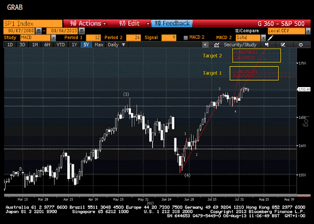
-          Projections taken from long, medium and short term patterns are forming a very significant cluster in the area between 1720 and 1830 (Chart 1 , golden rectangle)

-          Elliott wave short, medium and long term patterns will be perfectly traced if we move just a bit higher than yesterday (see chart 2 for a better detail)

-          We have a MACD divergence signal

-          One of the sector that has shown strength since the 2011 bottom is now very close to its own targets (Chart 3, Financials). Divergences (not shown) are also forming on both daily and weekly levels, and patterns would be concluded by a small move higher

-          If we look at the least loved sector (Materials) , we have a classic reversal formation: a rising wedge with a clear MACD divergence (chart4)


Conclusion


A break of the 26th July low at 1670 (on the future contract) would be a warning (break of previous high and short term support) that the S&P500 may be turning south. 

A confirmation of this possibility would come from a  break of previous support at around 1600:

-          This is the level of previous tops in 2000 and 2007: a move below this level means that the move up from april and the new highs are just  a “bull trap”

-          A break of 1600 would also coincide with a  break of the trendline that has supported the move from the bottom in 2011

-          A move below this level would as a minimum signal that a correction of the same order of magnitude of the one we had in 2012 has a very high possibility of happening


Chart1 – Weekly                                                                                                                                                                                                                             


Chart2 – Daily


Chart3 – Financials


Chart4 – Materials


LQD and HYG (USD inv grade and HY)


-          Investment Grade (chart2) looks much more advanced in the sell off, I would expect this move to continue to 109-110 before finding support. This is 2 or 3% lower from here. A failure to hold the level would point to 103-105 (so 7-9% lower)

-          HY has held much better but now  is catching up (chart1). My central scenario implies a continuation in the sell off to continue to the first golden rectangle (84-87), which 6% lower. If this level doesn’t hold a move to the strong support area at 80-82.5(8/10% lower ) is totally possible in the medium term.

Chart1


Chart2

Tuesday 13 August 2013

Disclaimer

NO FINANCIAL ADVICE - The Information on this forum is provided for education and informational purposes only, without any express or implied warranty of any kind, including warranties of accuracy, completeness, or fitness for any particular purpose. The Information contained in or provided from or through this forum is not intended to be and does not constitute financial advice, investment advice, trading advice or any other advice. The Information on this forum and provided from or through this forum is general in nature and is not specific to you the User or anyone else. YOU SHOULD NOT MAKE ANY DECISION, FINANCIAL, INVESTMENTS, TRADING OR OTHERWISE, BASED ON ANY OF THE INFORMATION PRESENTED ON THIS FORUM WITHOUT UNDERTAKING INDEPENDENT DUE DILIGENCE AND CONSULTATION WITH A PROFESSIONAL BROKER OR COMPETENT FINANCIAL ADVISOR. You understand that you are using any and all Information available on or through this forum AT YOUR OWN RISK.
RISK STATEMENT - The trading of stocks, futures, commodities, index futures or any other securities has potential rewards, and it also has potential risks involved. Trading may not be suitable for all users of this Website. Anyone wishing to invest should seek his or her own independent financial or professional advice.

Japan


Recent price action on Nikkei increases the probability that the current correction is developing as a sideways move, most probably a triangle.

This points to a final move higher, most probably to 17000 which is also very close to the 2007 top (18200)

 A move below 10000 would invalidate the whole analysis but even a weekly close below 11300 would make me very nervous.


Italian 10Y

Italian yields are tracing a potential reversal pattern. A break above 4.5% would be a warning signal and a break of the 5% level would put a high probability on a continuation of the move to 6%-6.2%.

This would be a 2% move from today level and may well happen swiftly. Expect renewed talks of default/renegotiation etc if this happens.

Unnoticed by most people, yields have finally managed to break this down sloping trendline (red circle, Chart1), reached 5%  and have been drifting down since while staying above the dashed line.


If we zoom in these last 9 months (chart2), we can identify a potential reverse head and shoulders, which is a very reliable reversal pattern. Moreover, the right shoulder is now forming a falling wedge, which is another reversal pattern.

A break of the wedge on the upside (should be somewhere around the 4.5% level) would increase significantly the possibility of a move to 5% where we have the neckline. A break of the neckline would complete the reverse H&S and point to a swift move to 5.5% (first) and 6%-6.2% later as final objective.


Chart1                  


 Chart2


Commodities


After falling for more than 2 years (peaked in May 2011), the CCI index looks like has found some support.   A 15% rally from the current level to 600 is totally possible even if considering we may be in a secular bear market.

This follow the 25% rally from the bottom of gold miners (anticipated as a strong possibility a few weeks ago) and the bullish move in oil , where 120 on the WTI remains my first target (10% higher from here).


-          The CCI Index has found support at 500, where we have the 2012 bottom and 2 intermediate tops in the 2010 rally

-          The index has formed 2 distinctive bottoming candle patterns:  a morning star first and a hammer/bullish engulfing afterwards

-          MACD is clearly diverging on a weekly basis

-          We can count 5 waves done, with wave 5 extended as it is common in commodities moves (in equities wave 3 tends to be extended)


Alll of this points to a completed move and therefore to at least a partial retracement. A 38.2% retracement (bare minimum) would push the index up 10%. My inclination would be for a deeper retracement, to test previous resistance at 6oo which also coincide with the 50% retracements ( a 15% move from here).


A break of the 500 level and a close below would invalidate this analysis and point to much lower prices.


Chart1       

                                                                                                                                                                                                            Chart2